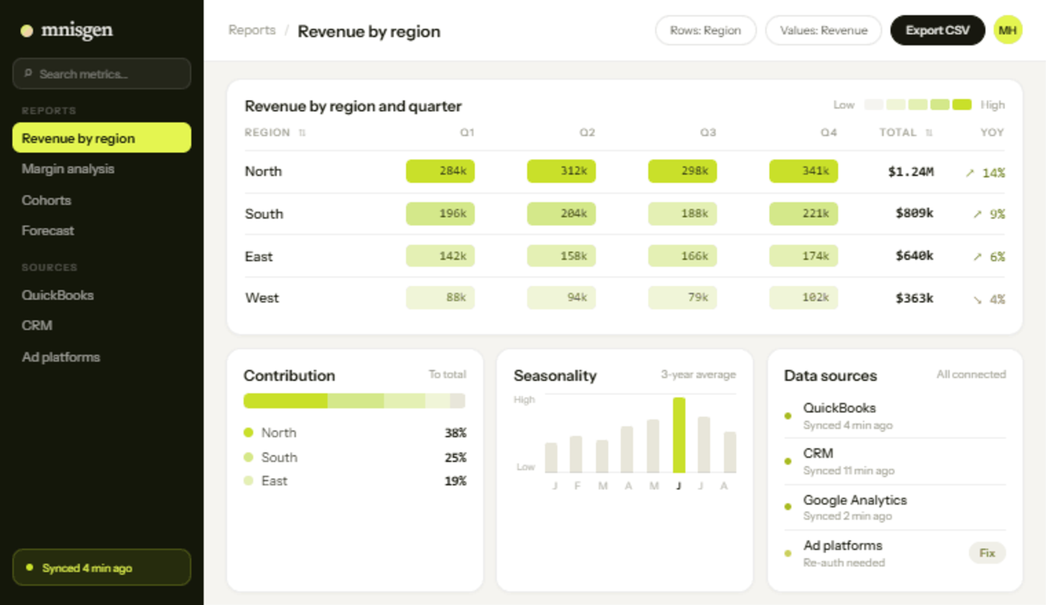
A reporting project usually looks straightforward. The data exists, the tools are mature, the charts are not hard. Then the first dashboard goes in front of the leadership team and two people disagree about a number, and the project stops for three weeks.
The disagreement is almost never about the chart. It is about a word.
The disagreement is upstream of the chart
Take “active customer”. Sales means anyone who has bought in the last twelve months. Finance means anyone currently on a paid plan. Support means anyone who has logged in this month. All three are correct, all three are useful, and all three produce a different number on the same slide.
The same goes for revenue booked versus recognised, a lead versus a qualified lead, and whether a cancelled order that was refunded last month still counts against this month.
Until the numbers are on one screen, two departments can hold two definitions indefinitely without conflict. Reporting does not create the disagreement; it just makes it impossible to keep ignoring.
Write the definition down
For every metric that will appear, write one sentence saying exactly what is counted, one saying what is deliberately excluded, and the date range it applies over. Keep it next to the chart, not in a separate document — a definition nobody can find while looking at the number does not settle anything.
This takes about an hour for a first dashboard and saves the three weeks described above. It is also the single best predictor we have of whether a reporting project will land.
One owner per metric
Give each metric a named owner: the person who decides what it means when a new edge case appears, and who is asked before the definition changes. Without one, definitions drift silently as people patch queries, and by the following year nobody can explain why the trend has a step in it.
Then build the chart. It will take less time than the conversation did, and it will survive contact with the leadership meeting.